Textual Analysis
Final Destination 5 Movie Trailer
The movie trailer that I’ll be analysing is a horror film named final destination. This is a gory thriller type of horror genre and appeals to any audience who find tension building in a film fascinating.
The teaser trailer starts of with a voiceover of a narrator talking. The edition in the speech had been done to in a way that there is an echo within what he says. This expresses the uncertainty and tension because what the male is saying doesn’t seem clear and it is also deep so there is that horror tension as he is speaking. After the voiceover is finished, the trailer moves on to a quick cut of a extreme close up of a hand, held on tight on to an object, almost, almost as if there is a slight tense of fear within this character. The foley sound effects done when there is a quick cut of the hand links to the sounds of a face racing car on a track which links on to the actual film and gives the audience a bit of a tease and an idea on what the film could be about. The director made this visible for the audience so that they know that they’ll also be experiencing a lot of tension building and fright within the movie.
It then fades into a black screen and another voiceover emphasises “you can’t cheat death”. This shows that a lot of people are expecting to die within this film if they try and cheat death. Though most people will be thinking what this teaser trailer is trying to get out when the character says, “you can’t cheat death”. After this fade out, it then shows a collage of quick cuts of a previous sequent then cuts of a track with face cars going by. Almost as if there is a link between the previous sequent and this sequent they are advertising now.
In addition, due to the quick cuts of the fast cars passing by, it gives that feeling of insecure within the film, like there is a link between the car track setting and the characters which the audience which the audience have to figure out themselves. It builds that imaginative thinking for the audience, like for example if the characters are going to die in the car track setting or is there something bad that’s going to take place, hence the shot of the previous scene showing a moving roller coaster where certain characters died.
The trailer then shows an object flying out of a racing car, which is still driving and then stops and fades in to a black screen. From the fade into a black screen, it represents death and uncertainty like people don’t know what’s the cause to the death and horror within this movie.
After the quick cuts of the fast racing cars and the fade out, another voiceover says: you have to follow the signs. This teases the audience as they may be thinking what signs are they are talking about that they have to follow. It makes them want to go see what exactly does this film mean by that.
The trailer then cuts into a zooming in shot of a character looking puzzled and surprised. The focus of this character isn’t sharp; to show that there is a sense of uncertainty and fear within this character. This makes the movie look even more interesting because it makes the viewers wonder why he is looking in such way. In addition, it then moves into cuts of other characters within the film looking scared as if they are too experiencing something terrible in the movie and it also includes a zooming in shot of the characters eyes. As if they are able to see the future or know what is going on, or maybe they too are also the main characters within the movie.
One of the cuts in the trailers shows a close up of a woman looking around her and looking frightened, to express that horrifying experience is taking place and the fast pace of the non-diegetic sound builds the tension and makes it more interesting to look at. The close up of the eyes also gives that mysterious feeling towards the characters. The shot of the woman experiencing pain is quite common within teaser trailer. To tease the audience so that they don’t know whom the killer is and why they are experiencing the pain. This makes the audience wonder why they are in pain and will try to imagine what exactly is going on and taking place in the trailer so they will want to go and see what the film is about.
The lighting of the film trailer is high key during the fast raving cars and then shots of low key lightening during the painful experience cuts to link the unsafe situation within the shot.
It then cuts into digetical screaming voices and shots of a man building with his mouth open as if he is also screaming and is in pain and agony. This also teases the audience because they don’t know why exactly he is in this situation.
At the end of the trailer is quickens up with shots of people in the hospital and dying and the tensions dies down. This puzzles the viewers and makes them confused. The props used for the audience to know this is taking place are the breathing gas machine and the settings of where the characters are.
In conclusion, the trailer is mainly showing the pain within the characters and the gory parts to the film so that it doesn’t give too much away but lets the audience know that this is a horrifying experience.
Textual Analysis
The Human Centipede Poster
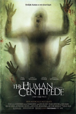
The movie poster which I’m going to be analysing is the one created by Tom Six. This poster comes from the film “The Human Centipede”.
The caption taken is unfocused and the blur sympathies the uncertainty within the character in the poster. Looking at the main image of the poster, the audience can see there is a slight sense of horror within this image just by looking how unfocused it is. Strangely enough, the image then begins to sharpen up towards the edges of the image and the poster. Almost as if the designer wanted the audience to pay attention to the edges, this implies that the designer wanted us to see how that there are 2 other human beings hands spread out behind the man/woman in front. Therefore the designer portrays the film to be mainly about centipedes, but a humanly version. This is because if the whole image was blurry most of the audience wouldn’t realise that there are two other hands behind, they’re possibly more likely to look passed that but in this case the designer wanted us to concentrate on the two other hands behind, as well as the one in front so that we are aware of what is meant by the human centipede – humans made into centipede.
Moreover, the image is also blurry mainly in the middle as because it’s the first thing which catches one’s eyes and to also give that sense of unawareness. The lack of knowledge towards this poster will then stimulate people’s imagination/connotation in terms of what the film could be about and will then provoke people to want to watch the film and understand the meaning of the poster because their thoughts of the film could’ve been a positive outcome.
Horror posters are usually seen and set out in a low key lighting. This poster follows this rule because the image itself has a low key lighting. Whereas, if it was done in a high key lighting, the poster wouldn’t bring out that horrifying affect that it has now. Low key lighting is commonly used in the horror genre to amplify the thoughts of alienation from the audiences.
In addition, the Non-Verbal communication expressed within this poster shows some sort of fear and represents someone/people crying out for help. This is shown through the use of a man/woman’s mouth wide open and his/her hands out in the wide open, almost as if he is in pain and agony and is calling out for help.
Colours
The main colours used within this poster are green, black, red and white. The green within this poster represents nature and LIFE. As you can see, the green fades into a dark, misty, black colour towards the bottom of the poster – almost as if there’s no life within the bottom of the poster. This implies that the character in front of the image has more life than the rest of the character within the image as the green fades into black from the 2nd person, towards the 3rd person at the back. Due to the fact that green represents nature, this shows that the type of movie represented within the poster is a more scientific based film.
Black symbolises the sense of fear and bad experience, therefore the character at the bottom is experiencing a lot of fear compared to the character at the top.
The red shown in the poster are blooded handprints, this emphasises that this poster is based on a horror genre as the only way one can have blood hand prints pressed against a surface is If they are wounded or in pain and the non-verbal communicational within the character expresses pain and agony, so the blooded hand prints stresses this image out.
The fonts used in this poster stand out and are easy to read because it is written in large, capital letters. This allows the audience to be able to read the text more easily and because it stands out towards the audience, it isn’t hard to separate the text from the background as read it. This is because the white used in the Sans Serif font doesn’t blend with the background and the other images in the poster. Moreover it is the larger text within the poster so the audience wouldn’t get confused as to what the title of the film could be.
His flesh is in his fantasy relates to the scientific and gory/bloody terms discussed within this poster. Nevertheless certain audience may question themselves as to who the “his” in the phrase is. There is some sort of uncertainty as to what this caption indicates about the poster/the film.
The composition of the image is set out in a rather symmetric way. This gives the audience less to look at as the image is set out with 3 characters in the middle of the shot with their hands in the air. If they were doing something else which led to a more asymmetric image, it will give the audience more to look at because they will have to look at one section then another. This shows that the designer wanted us to look straight at the image because it was shot in a symmetric way so it’s more eye-catching/appealing to the eyes and he wanted this to be the first thing we see because he wanted us to try and figure out what the hands are doing there and what exactly is going on in this image.
The angle of the camera is quite low and the shot of the image was taken from a medium long shot. This was to show that the power is in their hands, almost as if they don’t have anyone else around them to save them. So they are there to save themselves. Hence the low angle shows the authority is within one/a group of people. Therefore, the designer was trying to imply that all the pain and agony expressed within this one image is all to do with the fact that they are in need and help BUT the power is in their hands to save themselves. In addition, the designer wanted us to see all of them interpretation which is why it’s a medium long shot so we have mildly understandable view of all of this going on within this one image.
This poster basically demonstrates the pain and agony within the film. It expresses the gore within the horror genre of this film through the use of blood and also includes the term “100% medically accurate” and “his flesh is in his fantasy” to show that this is not only a gory type of horror but to also show that science is related within this film.
In conclusion, I believe that the representation of this film is horrifying and will leave people clueless as to what this film may be about, positively leading them to want to watch film.
Textual Analysis
Horror Magazine - Horror Hound
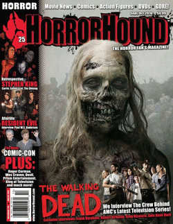
The magazine front page cover is from the film named “the walking dead”.
The lighting of the front page cover varies as the background of the image is more lighter/brighter than the actual character. This implies that the designer wanted the audience to get a good first look at the character rather than the background or anything else within the magazine. I know this because the image of the character is also laid out in front of the mast head. Then again, if the masthead was in front of the character, we will be entitled to look at the masthead first before anything else.
The non-verbal communication shown within the main image of the magazine is quite abnormal. The main image showing a character looking mysteriously elsewhere rather than straight at the camera gives that sense of suspense as to what he is looking at. Maybe he is looking at his next victim? This look will give the audience thoughts as to why he is looking in that direction.
By observing the poster I can tell that the setting of the image is indifferent, like there isn’t a place in the world that looks like this. The colour of the background is mainly muddy green and grey. This reminds me of the colours in a graveyard, this shows that the designer wanted to be more creative as to blurring the colours of the background, making it look like a graveyard. This is done to relate to the horror genre of the film – zombies.
The character in the image looks rather old; he has grey hair and looks as if he has been woken up from the dead. This relates to the title of the film “the walking dead” which is laid out beside a wide shot of character holding props (weapons), to emphasise that they are aiming to protect themselves and kill the walking dead. The costume used for the character in the main image makes the character look beastly like.
Coincidently, the camera angle of the image is at eye level. Yet the character in this main image isn’t looking towards the camera. The reasons for this is because the designer wanted us to have a closer view the main image, so that we can see the facial expressions within this character as we see the image such as the no eye contact. To express that this is clearly a zombie because eye contact is a form of communication, and if this “creature” isn’t making any eye contact with the audience then this could relate to the title “the walking dead” because “the walking dead” wouldn’t be able to connect or communicate with humans/the audience.
Whereas, the wide angle shot of the secondary image (at the bottom right hand corner of the poster) is shot in a low angle to emphasise that these people are in a higher authority compared to the zombie. As the shot of the zombie is only shown at an eye level shot. To could relate to the props that the characters in the wide angle are holding because they have weapons to defend themselves which explains why they are in a higher defence than the zombie who is only at an eye level.
The composition of the image is in the middle 3rd of the magazine for the audience to have a first view of the main image in the magazine before anything else. The main image is also asymmetrical, relating to how uneven the how poster looks. In addition it interpolates the unorganised look which also relates to the horror genre it is implying within this poster.
The cover lines are dull and boring, which shows that this could appeal to those who are older than I am – properly those within the ages of 30s+. Although the colour of the text is red this still emphasises that this is a horror type of magazine.
The Masthead’s typography is black and has a red shadow. Usually fonts like this will be dripping down in red but in this case it’s dripping down in black. This relates to the sense of DEAD blood, almost as if there is some sort of decay within this magazine/film. In addition, the dripping splatter of black in the Masthead gives that sense of fear because it gives that unorganised feeling within the magazine. The colour of the masthead stands out as it is more brighter than the image itself, but it doesn’t take the attention away from the image because the image is in front of the mast head, though the audience will still be able to relate upon the masthead straight after they’ve looked at the main image because the masthead is literally standing right out there with bright colours compared to the main image which is mainly grey and dull.
The USP states the word “horror”, this was deliberately because if one isn’t interested in horror then they wouldn’t be interested as to what the main magazine is mainly about – “horror”. Hence the selling line “THE HORROR FAN’S MAGAZINE”. Moreover, the word “horror” in the top left third is the first thing one will see if the magazines are layered out in a stack of shelves, one beside the over (overlapped). Therefore keeping the top left hand corner of the magazine simple will make it easier for the audience to skim read whilst looking through the magazines and the word “horror” will pop out at them.
The serif fonts within this magazine are old fashioned which could relate to how the dead walking people will be looking in terms of being “old fashioned”. The reason why it looks old fashioned is because there isn’t any lively colour added into the images such as skin tone. Though this implies how dead the designer is trying to make the look of the characters seem so that it represents the title of the film “the walking dead”.
The movie magazine front cover gives a substantial amount of secondary images in the left third in order for the audience who are skim reading through the rack of magazines to see what type of horror is included in this magazine. The first image on the top left hand corner looks demonic and strange and because it is the first image one will see on the top left it gives that variety inspiration towards the magazine.
In conclusion, I believe that there is a highly an unlikely chance that those within my age group (16-18) would be interested in this type of horror. This is because horror movies nowadays are more psychological and horror genres are a bit old fashioned, although later ones have now been updated with more colour and liveliness, unlike this magazine which looks like a 1980s movie magazine which wouldn’t make it appealing to those my age but to those in the middle aged generation and above.
