Textual Analysis
Scream 4
Scream 4 is directed by Wes Craven and produced by Kevin Williamson. It was release on 15th April 2011 and this movie was distributed by Dimension Films. The production budget of the film was $40 million.
Some of the actors and actresses in the movie are Hayden Panettiere, Adam Brody, Kristen Bell, David Arquette, Courteney Cox and Neve Campbell. This movie was created from a series of sequels called Scream, with the first film being released in 1996.
Scream 4 is about a girl named Sidney, who experienced the brutal killing of many of her peers. After leaving the town where the killings took place, some years later Sidney returns home for a one off book signing tour. While she is back a killing spree, which was very similar to past events, begins to unravel involving the targeting of teenagers in the local high school. The police officer called Dewey, finds out that there maybe a clue in the place where Sidney’s book signing is happening. After Dewey investigates, news soon gets around not only the school, but also the town. As the movie develops, the killings become more frequent, until it gets to a point where a masked killer attacks a girl named Jill (Sidneys cousin), who later goes missing. We find out later that there is 2 killers, a character called Charlie, and actually Jill herself. Jill ends up killing Charlie and framing the killing on her ex-boyfriend. She attempts to kill Sidney, but fails. The last scene, when Jill realises she failed to kill Sidney, there is a fight, and Sidney kills Jill.
The genre of this film is 'horror slasher' and the narrative is dominated by characters giving away gossip, and aiding the mystery. The length of the trailer is 1minute and 30 seconds, and during the trailer it shows a few various shots, with a slow build up of non-diegetic music.
The teaser trailer opens with the distributor of the movie and a faint sound bridge that built up. As the music is faint, there is a phone ringing during the blur out and cuts to a blank black screen. The phone is then picked up and a feminine voice answers it. The voice of a man is then played and then it blurs out to a mid-close up of the Girl who is on the phone. As she is looking up, the music starts to create a bridge and switches to another black screen. The music fades into a low and deep, heart thump and it echoes through the scene and it switches to another mid-close up of the same girl but this time she turns around with her facial expression as scared, shocked and worried. The man's voice is then spoken again with the sound of the echoes of the heart beat and it fades out to another back screen.
The screen then switches to a 10 continuous shot of characters confused and clueless expression. Most of the shots are mid shots and close up shots of the characters and they fade in and out within 2 seconds each. At the end of the 10 continuous shot, there where two female characters screaming and from there it bridged over to a slow fade of text. During these cuts and it switches to another scene and shots, the background music plays a synchronous sound with the heart beat as it fades to another shot. Also the man's voice at the beginning also is still played throughout the scene making it seem to be describing every shot of the clips. The lighting in these clips is switched between both low and high key lighting because of the clips of the film and also by the blank screens that appears. The facial expression on the police man's face is shown in a shocked.
The next 44 shots are about the killer in actions but all 44 shots does not show how are characters gets injured and before me think we will see it, the shot quickly cuts to the next shot of characters falling and being injured or about to be attack. Thorough the 44 shots, there is a male voice bridged over each shot and they also within the 44 shots they show you who is talking and who’s the voice belongs too. This can develop more powerful concentration for the audience and keep them guessing to what may happen next until the end of the trailer which shows a 2 shot of girls in a kitchen, one sitting at a table and the other on the phone. The male voice appears on the other line and the girl talking on the phone gives it to the other character showing a shocked appearance on her face. Showing this in a trailer confused and also makes it a bit more interesting for the target audience to see what happens in the end and convince them to watch the film. The way the whole trailer was set out was a slow build up to the final moment where there is an urge to find out what happens next. Also with the characters narrating the whole trailer, it involves the characters emotions and attracts the target audience.
In conclusion to this trailer, I find the amount of shots takes a lot of time and also many different settings. This could be extremely hard when it comes to editing and putting the shots together but also it could take a lot of time up. The analysis of this trailer shows us a lot about different thing that is included in a trailer and how much effort is put into making it. Throughout the beginning and the end of this trailer I can see and feel the tension of this trailer and can see how teaser trailer is being build up to create an powerful atmosphere for the Audience to view also to make it the trailer confuse the audience to get an interesting result to the outcome of the movie.
Textual Analysis
Movie poster: Drag me to Hell
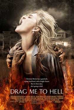
This poster is called 'Drag me to hell' and on the poster it has a girl in the centre with a dark background and flames at the bottom of the page with some text layered on top of it.
The lighting in this Movie poster is Low key lighting because of the dark background. It is clouded with a Smokey texture in the grey and black background. Also in the background of this poster there are two houses in the back behind the girl's shoulder. The house on the left of the poster doesn't show any house lights on inside the house whereas the one on the right shows a bright glow of lights on the first floor of the house. The colour of the background may have been deliberately done in dark colours because it may send a vibe that it's an unpleasant atmosphere and also it may have shown the mysterious darkness in the poster. The houses in the back could give off an unsettling feeling because the dark background compliments the glowing light in the right house. This background could also show us a clue to where some of the settings of where some of the scenes may be shot in the movie and there might be some sort of trouble that may appear in these moments. The houses in the background are really similar to each other that it looks symmetrical but one of the houses has a glow of light. This being shown as a background could imply a fore shadow in what may happen to the house where the house lights may randomly turn on or off. Also with the clouds above the girl’s head could also symbolise something bad happening because usually in a horror move, if bad weather is to appear in the scene it is telling you that something is about to happen. This is also a build up to create tension to the target audience and keep them interested until the scene is over.
In the centre of the poster there is a picture of a girl who is grabbed by three monstrous and devilish hands and being dragged down to the red flames. The girl in the picture is wearing a grey blazer and a low top. She is also wearing earrings and a necklace which is grabbed by one of the demon hands which is trying to drag her down to the flames. This picture of the girl shows that she is screaming out loud and you can tell by the way her facial expression is with her eyes closed tight and her mouth opened. Her body is a bit crouched as she is screaming and you can tell she is struggling to break free by the demons that are pulling her down.
This is a mid-shot of the girl as she shows her fear of being dragged down by the devilish hands and burning in the bright, red flames by the hands of the demons. The girl is facing up into the sky like she is grasping for air and letting out a final cry before she is dragged down by the flames and the hands of the Demons.
The colour of the girl’s blazer is in grey so it may compliment the colour of her hair and also to show the colour difference of the red flames. The colours of the flames appeal to be fierce and strong. The way the red is exposed with a vibrate colour of red and orange attracts to the readers and because of the clothing and background of the poster is dark, it outlines the flames and shows how powerful the bright red is shown and it also gives away a sign of danger. The way the hands of the demons are represented in this poster shows how much strength the arms have and also how tight it is gripping on to the girl. The texture of the monstrous hands looks dry and scaly. The claws look sharp and harmful as it is about to grab onto the girl’s left shoulder. The other side of her shoulder there is a claw that shows a tight grip her arm and there is another hand that is gripped onto her necklace. The way how the Demon’s Hand is pulling her to the flames shows how tight the grip is and you can tell by the way the necklace is tight around the girl’s neck. This could symbolise the greed demons may have for money but also the fresh of a human that is about to suffer. The demon hand that is gripped to the girl’s necklace could also show how she is trying to grasp for air.
The anchorage in this poster is a san serif font and the way the text is shown on the poster stands out because of the white text. The caption on the poster is small but affective because of how bring and plain the text is. Also the name of the film is in the same colour so it may contrast against the flames and the dark background. Underneath the name of the film there is the director’s name and actors and actresses that are in the film coloured in an orange which is darker than the colour of the flames of the poster. The way the text is shown is in a sentimental way because it appeals to the reader with the picture of the girl and how the colours are contrasted to the shot of the girl and the background of the poster.
Textual Analysis
Horror movie magazine front cover
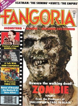
The magazine that I'm going to analysis is called 'Fangoria'. I had an image of a zombie as a main image and then a cover line at the bottom with a film strip at the side. On the top of the magazine, there is the main heading of the Horror magazine and at the bottom there is cover lines.
The setting of this magazine front cover is a plain soft yellow background. This frames the picture of the zombie and the text around it also it shows an outline of the zombie’s features that is around its head.
This magazine has a high key lighting with bright colours and a bright background but the zombie is a low key lighting because of the features it has. This is an eye level shot and a med-close up of the zombie's head. The zombie's features is a head which had dirt all over its face and on the left of its eye, there is a bunch of worms. The nose of the zombie is blocked up with dirt and it covers the side of the head. The mouth of the zombie is opened showing the different length of the teeth in its mouth and also its teeth looks stained with dirt and blood.
There are 4 teeth that the zombie has, there is a sharp tooth that looks like a canine tooth and there are over grown teeth that has stains. The gum of the Zombie is covered in dirt and the lips of the zombie are covered up in dark brown dirt. The neck of the zombie is covered in thick dirt and the colour of the skin of the zombie is a pale white and it looks ruff and also the face of the zombie is white and ruff, with dirt covering the main features of the face. The facial expression on the zombie face looks like he is smiling in delight. It has no eyes but judging by the facial expression of the zombie, it appears that it can see straight at you through the magazine front cover and it has the look of a hungry zombie. This may interest the viewers because the texture of the features may appeal to them and would be attracted to the magazine.
The type of font that is used in this magazine is sans serif font. The Masthead is bold and coloured in red with a boarder with yellow. The red in the text makes it stands out from the rest of the magazine and also the cover line is red where is says 'zombie'. This text is also in capital and it shows that it is related to the Masthead because of they are linked with the colour red. Under the Masthead there is over Cover lines which also links to the magazine, the red in this magazine shows the awareness to the viewers and making things on the magazine stand out. Also with the white of the cover lines at the bottom with the red cover line 'zombies' compliments each other also with the Zombie's neck as part of the background, it stands out and appeals to the Readers. The colour red is used really affectedly in this magazine because it shows the link of the information shown on the front cover. The red is especially interesting for a horror magazine. The colour red symbolise blood and danger in a horror film or program and in most horror movie there is blood being symbolise in a different way. The way Fangoria’s magazine connects it’s masthead with the text ‘Zombie’ by the colour give away that this text ‘Zombie’ which is in red, is represented in a dangerous and unpleasant way. Also with the red text under the masthead could also imply that it is linked to the Zombie text or the masthead of the magazine. The way the Red is shown on the magazine stands out and it sticks out compared to the other texted and cover lines on the front cover. This wills make the readers interested and makes their eyes attract to the information that is shown.
On the left hand side of the magazine, there is a film strip that features some TV programs. This may attraction the readers to see what other films there is and what else there is in the magazine. The layout of the film strip shows the readers that there are programs others than the main image and focus of the magazine front cover. The layout of the film strip of the magazine shows a context that could also bring attention to the target audience. This may be able to give the readers something interesting to look at and read about if they want to find out other programs in the magazine. The text and the film strip of this magazine, frame the picture of the zombie and also it frames the features on its face, mainly the eyes and the teeth of this picture. By doing so, it makes the readers focus on the features as the text and film strip boarders it on the side of the page and because of the zombie’s features is dark, the brightness of the magazine make it look bold and noticeable to the viewers.
