Question 1: In what ways does your media product use, develop or challenge forms and conventions of real media products?
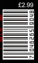
Forms and conventions within media products are the common values they all share as a whole, for example a magazine cover featuring a bar code, or a trailer featuring the product's release date at the end of it.
|
The purpose of a teaser trailer is to give the public a general taste of what your product has to offer without completely explaining the plot or outcome of the movie. It is also to produce a feeling of excitement or 'hype' for your product, to encourage the general public to anticipate the release of it. For our A2 Media Course work we were given the task to produce a film package consisting of a Horror movie trailer that would be featured and broadcasted on the popular video sharing website 'YouTube'. This means that our trailer product is following a convention already, as most films companies release their trailers onto YouTube, as it is a free form of advertising and YouTube is home to over 500 million unique internet users.
|

|
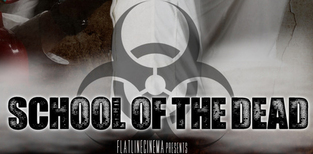
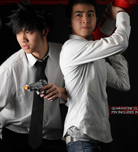
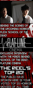
We also had to produce a Movie poster, and a Movie magazine front cover to promote our Survival Horror film: 'School of the Dead'.
To explore and analyze the forms and conventions within media products to enable us to decide which conventions we would abide by and challenge, we all looked at examples of real media products created by official production companies.
|
In this video I go over a couple of the trailers we researched, and the conventions and forms that we used when creating ours.
The two videos to the right are the trailers featured in this video that we used when researching conventions and forms within real media products. |
|
Fast Cutting (Montage)
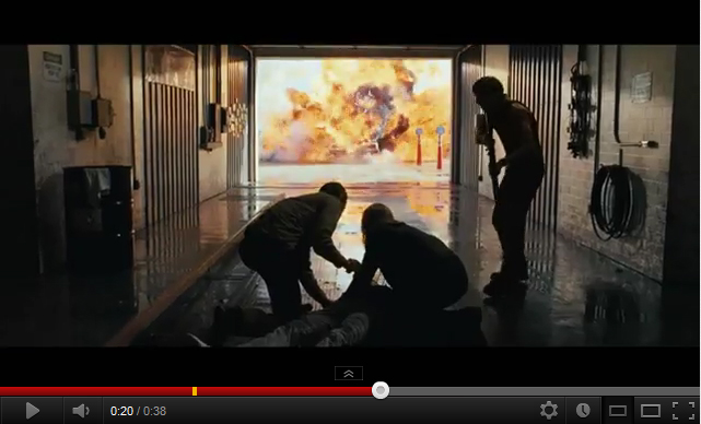
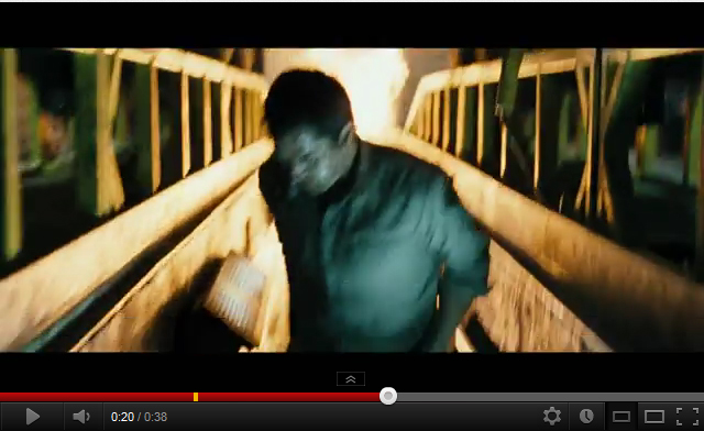
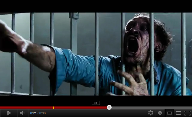
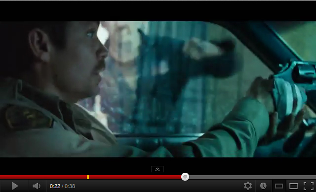
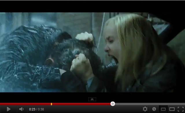
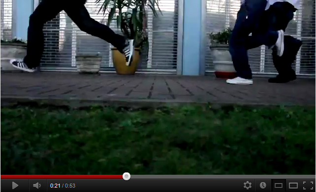
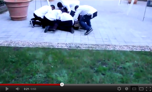
As discussed briefly in my video above, a convention followed by many trailers of the Horror genre is the presence of fast cutting, or a montage. Fast cutting refers to the use of several consecutive shots within a brief duration. This can be used to convey a sense of chaos or adrenaline, as the fast pacing throws the audience into a state of disequilibrium, as they are initially greeted with a steady pace of shots, then presented a flurry of cuts unexpectedly.
'The Crazies' Trailer #3 is what inspired us to follow the convention of having a montage within our trailer. Below is an example of the Fast Cutting featured within 'The Crazies' trailer, and ours, with each clip lasting no longer than a second.
The Crazies:
Shot 1.
|
Shot 2.
|
Shot 3.
|
Shot 4.
|
Shot 5.
|
School of the Dead:
Shot 1.
|
Shot 2.
|
Shot 3.
|
Shot 4.
|
Shot 5.
|
The reason why we decided to adopt this convention is because that although our trailer is of the horror genre, we wanted there to be elements of action and high-octane thrilling moments, therefore fast cutting allowed us to create the ideal fast pacing we wanted with our trailer.
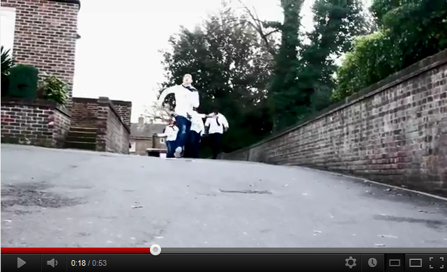
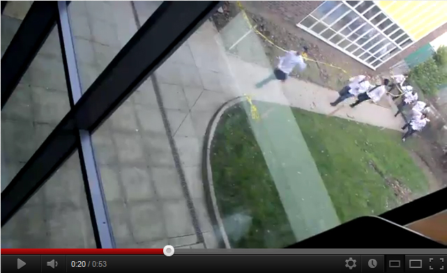
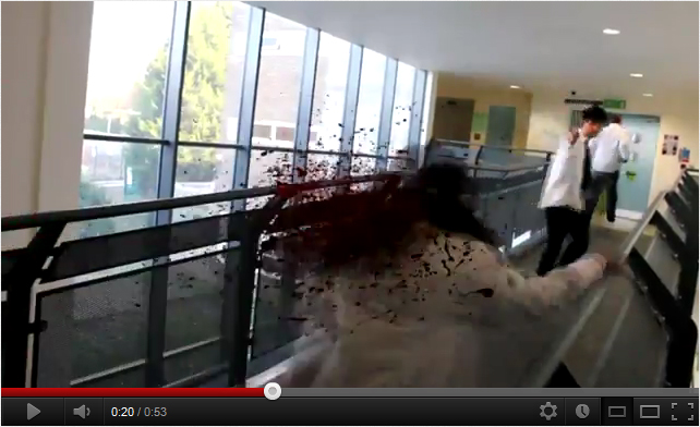
The Long TakeA convention present within the majority of horror trailers is that the scenes shown are short and quick, hinting nothing about the events of the movie while showcasing the action and a glimpse of the story. However this is a convention that we challenged, as towards the end of our trailer we present a 17 second long take at the end of it, leading to the final scare. The purpose of this was to create a moment of utter silence and confusion after the high paced montage, playing with the emotions of our audience, as our montage forces them to feel a sense of panic, followed by the long take which tricks them into a false sense of security and calmness, making the final scare shock the audience even more.
|
An extract from our trailer, the long take.
|
Perspective
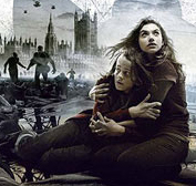
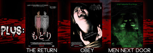
A convention shared with most horror movies (and movies of any genre in general) is that it is created to be watched from a Third-Person perspective, as if you are an invisible omnipotent being watching all of the events as they unfold within the movie and the characters cannot see you. However lately a new style of perspective has been growing more and more popular within the Horror genre lately, and this POV (Point of View). This is where a story is told through the point of view of our protagonist and in some cases antagonist, usually through the medium of a video camera. This style has been utilised by hugely successful grossing movies such as:
Chronicle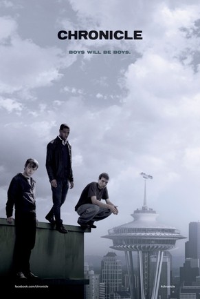
|
Cloverfield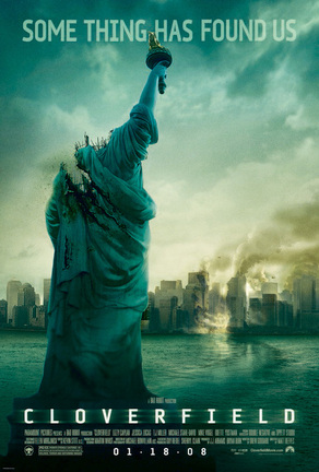
|
REC [English version:Quarantine]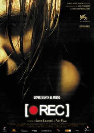
|
So to allow us to gain a wider portion of our target audience we decided to implement this POV perspective style into our product, meaning that our product is mainly shot from a Third-Person perspective, however has elements of POV within it as well (scenes featuring the perspective of the video camera), meaning that we please both the people that like a third person perspective movie, and the people that prefer Point of View. Therefore as our movie is shifting between both perspectives we are challenging the common convention of a movie only sticking to one, as all three movies above purely stick to POV (however in Chronicle this is done a lot more cleverly as there is a use of many different forms of POV) and movies such as A Nightmare on Elm Street purely sticks to Third-Person perspective.
challenged however was shifting from a general third-person perspective trailer to a POV (Point of View) call of duty
challenged however was shifting from a general third-person perspective trailer to a POV (Point of View) call of duty
Captions
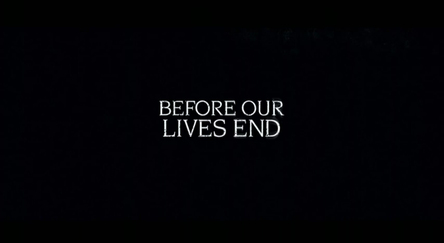
The Crazies caption 1
|
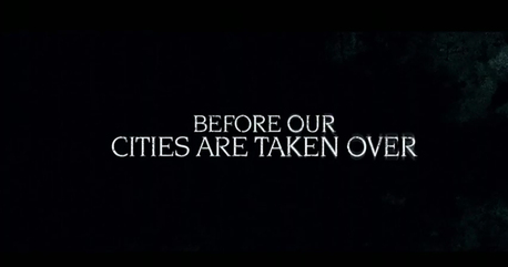
The Crazies caption 2
|
These are the captions from 'The Crazies' Trailer 3, this is a convention seen in a large array of Horror movie trailers, and their purpose is to give small sections of the overall sentence, to encourage the audience to carry on watching so that they can find out what the next line will say, as 'Before our lives end, before our cities are taken over' in one large sentence isn't nearly as dramatic as displaying half of the sentence accompanied by various clips, then showing the next title before or after the final scare.
School of the Dead caption 1
|
School of the Dead caption 2
|
As you can see here we abided by this convention, as we believe that it gave a nice, slow, dramatic pacing to our trailer, as you would be shown a dramatic clip, then forced to wait and anticipate the next clip while the current caption is on screen.
The Symbol
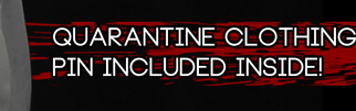
Another convention we followed was to have one specific symbol that would feature on all three of our media products to act as some what of a logo for the media package as a whole. This logo is a 'Quarantine' symbol, and we chose this as it relates to viral outbreaks and the immediate closing off of infected areas, which fits our trailer perfectly. It would also make our product much more memorable, as a symbol such as this would encourage the public to think of our product, whether they have seen our product advertised on a bus cover or our trailer on Youtube or Vimeo.
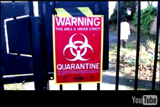
Trailer
The Quarantine symbol on the sign put up by a scientist in our trailer, the symbol is somewhat of an 'Easter egg'
|
Movie Poster
The Quarantine symbol featured behind the title of our movie poster
|

Magazine
The Quarantine symbol placed ontop of the margin located on the left-hand side of our magazine front cover.
|
Movie Poster Conventions
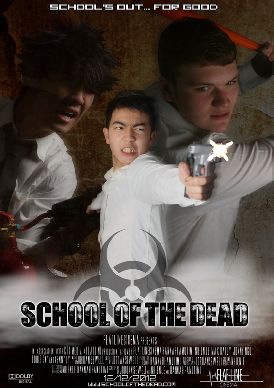
Our Movie Poster Product.
Including an official movie site isn't crucial, but very beneficial when creating a movie poster. This will allow the public when seeing this poster to go to the site and be informed of any news or updates about the movie. This is a convention we followed, by putting a make-believe site at the bottom of the poster.

|
We decided to follow this convention by using quite a distorted font, with our title somewhat resembling a neon sign that is running out of power. The font itself is quite daunting and creepy, which is why we chose to follow this convention.
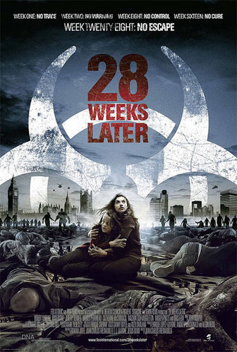
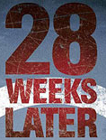
With this 28 Weeks Later poster although the two main characters are surrounded by dead bodies and incoming zombies, it is made clear that these are the main protagonists. Several techniques are done to show this, such as a bright haze/mist located behind the characters which instantly draws your eyes towards them. The dead bodies that surround them are also lack colour and are quite bland, where as with the main characters they seem to have been colour-corrected intentionally to be brighter than the bodies around them,
However we challenged the convention of featuring a setting or real background within the poster, and we placed a cracking grunge-type background instead. This was because we wanted to create a mysterious atmosphere with our product.
ALL movie trailers also feature credits in them towards the bottom of the poster stating the roles in terms of the production of the film, all usually in a thin sans serif font, varying in font size when stating the names and roles of each person.

28 Days Later production credits
As you can see, we followed this convention and placed the credits at the bottom of our poster.
A slogan or catch-phrase is also a convention featured in many movie posters, however the one featured in the '28 Weeks Later' poster is extremely catchy:
And this was a convention we decided to follow, titling it: 'School's out... For good' to relate to the title and setting.

|
Magazine Cover Conventions
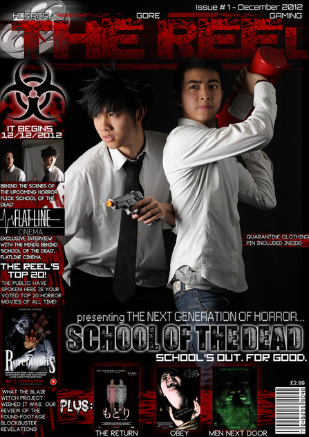
Our Magazine front cover product.
Subjects
However a convention that we have challenged in terms of models is that most movie magazine covers generally feature the main model(s) looking forwards towards the reader to create a sense of inclusion, however we challenged this convention as we wanted our actors to look as if they are in the heat of battle or are looking at something shocking.
Cover lines
|
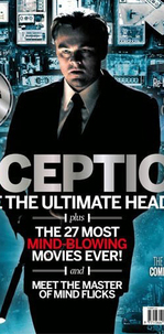
The final conventions to consider following, challenging, or adapting were the conventions in terms of our magazine cover. Much like our trailer and movie poster, we decided to look at existing magazine covers to analyse the existing conventions and traditions featured within magazine covers of today. One of the magazine's we looked at was Film Magazine's 'Inception' edition.
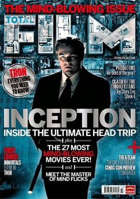
FILM magazine 'Inception' Edition
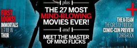
MastheadsThe first initial convention we saw was that the masthead of the magazine is featured largely at the top portion of the magazine cover. This is a convention followed by all magazines of any genre whether it be music magazines, sports or fashion, as it catches the attention of the public.
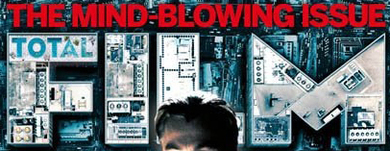
FILM magazine masthead
Therefore we decided to follow this convention as it gave our product a more authentic look:
Our magazine masthead
Movie LogosAnother convention is to have the featured movie logo accurate to the logo advertised everywhere else as a form of continuity. This is a form of advertisement used to make the public remember the logo of the movie which will encourage their intrigue and make them want to see it in cinemas. An example of this is with the 'Inception' logo featured on the Film magazine front cover:

The logos also generally feature a slogan or phrase relating to the movie. This was a convention we followed when advertising our movie trailer product:
Puffs
Our Magazine product puffs
Another convention we followed was having the issue number and date of release included in the magazine.

And also the convention of having a selling line featuring the main genres and topics that this magazine covers.

|
In conclusion, we feel that our media product package has utilised and adopted the common conventions used by other real media products, although we feel that challenging some of these conventions (i.e. making our trailer consist of both third person perspective and first person perspective viewpoints) were necessary, as it sets our media product apart from the rest, and unique products are what become the most memorable in the media industry, with the SAW franchise being an example (as not many other memorable movies have been solely based around gruesome torture). Overall we are extremely pleased with how all three of our products turned out.
