Textual Analysis
A Nightmare on Elm Street (2010) Teaser Trailer
'A Nightmare on Elm Street' is a 2010 reboot of the original film released in 1984 (Directed by Wes Craven). This film is directed by Samuel Bayer, however cinema legends such as Wes Craven (who directed the original movie) and Michael Bay were also involved in the production of this film. This is the 9th instalment of the franchise and was distributed by 'New Line Cinema' and produced by 'Platinum Dunes'. This trailer is over 2 minutes in length contrary to the common horror trailer convention of one-minute-thirty or less in length.
The trailer begins with an instant scare, with a swift bolt of lightning transitioning into an establishing shot of an American diner during a storm. A diegetic sound of rainfall and electricity short circuiting can be heard as the neon letters in the sign on the diner flicker, telling us that something ominous is taking place. A close up of a clock is then shown, however it ticks backwards instead of forwards, which instantly instils a creepy atmosphere and tells us that things are not as they seem.
A diegetic sound of a bell is then heard, followed by a muffled song playing, as if it's coming from another room, or perhaps emphasizing the fact that reality isn't present in this scene. We are then presented with a close up shot of a man which slowly tracks backwards, and then a long shot of the interior of the diner, which is deserted. There is a transition between green and red lights in the room, possibly connoting a sense of being safe, followed by being plunged into danger. As the man gets up, there is a Dolly shot of the diner, giving the impression that something is moving while watching him.
There is then a chilling diegetic sound of a creaking door as the man enters the kitchen. As he walks through the kitchen the music playing slowly begins to sound blurred and obscured and there are loose fires in the kitchen which could connote danger or a hellish atmosphere. The man is about to turn the corner when an ear splitting non-diegetic sound becomes apparent, and Freddie Kruegar appears to slash the man with his claws. The sound of freddie's blades resonate for a brief period after, which occurs multiple times throughout the trailer when he attacks his prey to emphasize how lethal Freddie is.
In terms of Mis-en-scene it's clear that this trailer is set in the American suburbs (which is generally a horror convention) as the movie is set in Elm Street. The lighting is quite minimal, however in scenes of Freddie Krueger's dream land yellow colour correction is used to emphasize the mist and shadows. Props also appear to be used to connote themes, for example freddies claws. The spine tingling sound made when each blade comes into contact with a surface could connote someone's fate being sealed, as when Freddie approaches one of the protagonists, he drags his claws against the wall.
When the main protagonist pours the man coffee at the beginning, I also think that the coffee could symbolise comfort or safety, as coffee keeps people awake, and while he's awake Freddie can't get to him. The outfits are also generally very casual and American esque, the general style that would be seen among modern american teens.
This trailer also features a barrage of quick cuts complimented by voice overs to add fluidity and continuity to the trailer, with captions connecting each clip in a blood red font.
The Incidental music is very eerie, with high pitched violin screeches audible that cause a slight tingle in your spine, much like Freddie's claws slicing on the wall, while a dreary piano piece is being played, which embraces the theme of nightmare and terror. There are several voice overs throughout the trailer, allowing various scenes from the movie to be showcased while at the same time explaining what is going on. There is also a chilling voice over from Freddie: 'Why're you screaming... I haven't even cut you yet' while a barrage of shocking scenes flash before your eyes.
There is a closing caption reading 'Don't fall asleep...' followed by the voice of a little girl singing Freddie's theme song which instils the feeling that the trailer is talking directly to you, warning you not to sleep - or else.
Textual Analysis
A Nightmare on Elm Street (2010) Poster
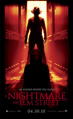
The colours primarily featured in this poster are red and black, which are the colours of the stripes on Freddie's jumper, which allows him to blend in with the poster and creates a theme of this being Freddy in his world. The red connotes blood and gore and impurity, while the black connotes darkness and seclusion. Both colours combined embrace the theme of nightmare and terror, which is the foundations upon what this film is built on.
There is also a black border surrounding the main photograph of the poster, making it seem as though the reality is fading into darkness. There is an extremely narrow corridor with a distorted perspective which connotes a theme of claustrophobia, which links to the plot of the film where in which the main characters are trapped in Freddie's dream world.
The main focal point of the poster is a medium long shot of Freddie Krueger standing in his signature sinister pose, with his claws shining. His face is concealed by shadow and only the main props which has made Freddie a horror icon can be seen, which is his striped jumper, hat, and claws. There is a window behind him emitting a large light upon Freddie, almost making him look angelic in a sense, which is a juxtaposition as Freddie Kruegar is far from angelic. However this could also connote the idea that in the dream world Freddie is a God and has ultimate judgement upon whoever falls asleep.
In front of Freddie is a pool of crimson liquid which is presumably blood, with a mid shot of a woman (that appears to be the main protagonist) sinking into this pool of blood. This could connote helplessness and sinking away from reality. She expresses very formal lifeless body language with an vacant expression on her face, which is far more creepy than an expression of fear, as it causes you to wonder how she is staying completely calm.
There is a Sans-Serif tag line in grey reading 'He knows where you sleep'. This is a clever linguistic tool as the use of 'you' automatically makes you feel as if you're involved and that the poster is targeting you directly. Also, the use of 'he' contrasts with Freddie's face being obscured, as if the producers of the poster didn't want those that hadn't seen the original movie to know who 'he' is, making Freddie an enigma. The theme of red and black remains concurrent even with the main text title, that is in a blood red Serif font that is partially eroded to keep the horror theme consistent throughout the poster. Associated companies are arranged with two on the left and two on the right, with a small cover line reading '04.30.10' in the middle.
The lighting in this poster is very inconsistent, as it's quite intense in some areas such as at the window, however extremely limited and dark in some areas for example the two characters featured in the poster. Symmetrical composition is also very apparent in this poster, with the hall, female, and Freddie aligned perfectly, however is interrupted by Freddie's claw. There is also a soft focus throughout the entire photograph, possibly representing the bizzare atmosphere of a nightmare.
Overall the poster successfully embraces the theme of nightmares and keeps it consistent throughout the entire piece all while using such a simple photo and limited range of colours.
Textual Analysis
Horror Magazine - Fangoria
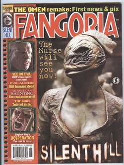
Fangoria is an Internationally distributed American horror magazine established in 1979. It prides itself in being the 'best source for horror movies, reviews and news'. This cover features a mid shot of a zombie nurse from the film 'Silent Hill' which is a movie remake of the popular horror video game franchise.
We are greeted with a denotation of the nurse seemingly looking up at something (which is quite ironic as she has no eyes). This connotes a feeling of anticipation and suspense as we do not know what she's looking at. The main focal point of the magazine cover is the gruesome crater in the nurses face, orchestrating the gore and horror within this movie. The nurse is also placed infront of the main cover-line, meaning that we are meant to focus our attention on the nurse first, and then pay attention to the cover lines.
The NVC of the zombie nurse appears very passive, as she expresses a calm composed pose, which contradicts the common convention of a horror antagonist being very aggressively animated on a horror magazine cover. This could have been done to give the zombie nurse a sinister edge, appearing very calm when in reality she is revising how she will kill you. There is a large depth of field between the focal point (which is the nurse) and the background, which is a common convention among film covers.
The lighting is very fine and clear, and It is apparent that the source of it is emitting from above the nurse. This shows us all of her main features as oppose to the generic horror photograph that lacks light and is shrouded in shadows.
The masthead is in a red comic-style serif font, outlined with a white stroke, which gives the magazine a very vintage feel to it. There is also a red and yellow colour scheme that is consistent throughout the whole cover. There is a text in an eroded Serif font reading 'Silent Hill' which is very distorted and enigmatic, much like the franchise in itself.
There is another cover line reading 'The nurse will see you now!' Which is a comedic juxtaposition as a nurse is a healer and provider of safety, while this zombie nurse is the complete opposite. There's a note book-like design to the left of the cover, featuring thumbnails of different articles and coverlines featuring the various contents of the magazine. There is a barcode located in the bottom left of the cover featuring the price of the magazine, with the issue number at the top left.
