Question 2: How effective is the combination of your main product and ancillary texts?
Creating three different media products that links together involves marketing, advertising and distribution. Coming up with ideas, we thought about a connection to our products and what sort of way it may connection with each other and so we thought about our texts and display, which mean we will be linking our product visually.
Creating three different media products that links together involves marketing, advertising and distribution. Coming up with ideas, we thought about a connection to our products and what sort of way it may connection with each other and so we thought about our texts and display, which mean we will be linking our product visually.
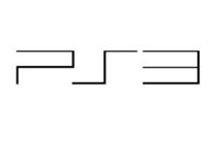
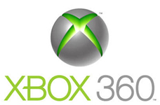
Our product is created for the theme horror therefore; my group and I started to research what type of horrors we wanted to do. In the end we decided that our genre will be gore and thriller so we worked towards it. We then went onto researching about what conventions our target audience would be interested in via internet use. The audience would be able to access the internet from smartphones, ipods, laptops, PC, game consoles such as xbox, psp, ps3, DS lite and more.
The majority of the audience are most likely to be seen viewing sites such as YouTube and Facebook so we thought about posting up our products on those websites so they may view it.

|

|
|
|
Also viewing these products on social sites like Facebook and twitter, we would be able to gain a larger amount of viewers, because social sites are capable of sharing videos and images and many others.
Instead of using social sites, we thought about other places we could advertise our products, such as on billboards. My group and I thought about places our audience would be hanging around, for instance on the streets near bus stops, underground or train stations. For that reason, we decided to apply our products on bus stop, on busses itself, underground and train stations so that our viewers can notice them.
We thought about how we could state to our audience our film is a horror movie, so we used visual and sound effects that would makes the audience feel uncomfortable but excited to watch our film.
Movie trailer and influences
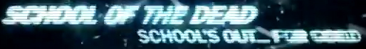
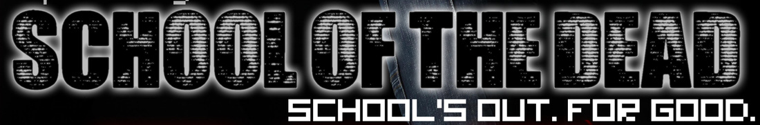
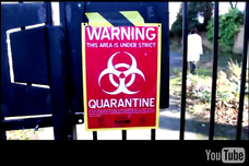
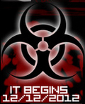
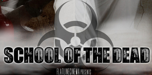
We thought about what we could use to link our products so we chose the title of the film as a main attraction and the Quarantine sign as an icon for the product.
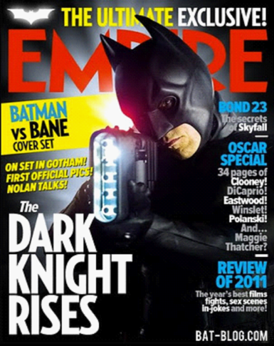
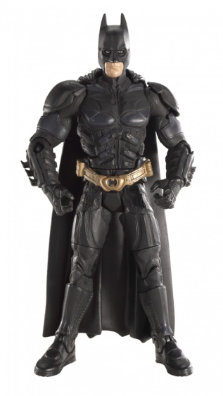
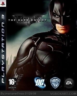
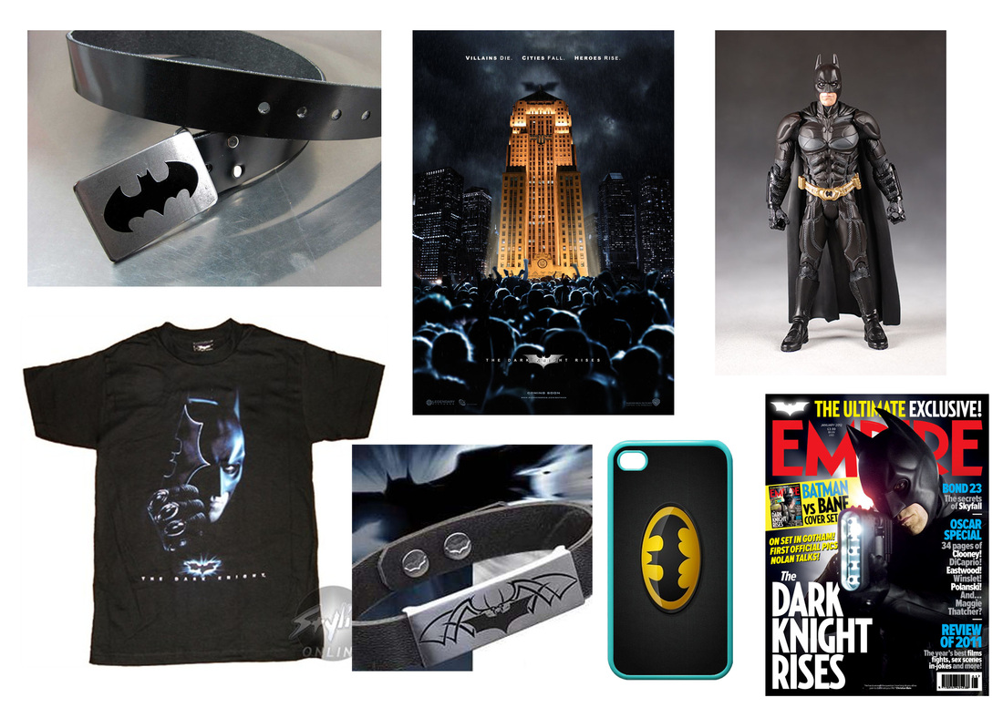
When discussing the synergy between our products, we thought about “The Dark knight” and how well their promotional package worked
When discussing the synergy between our products, we thought about “The Dark knight” and how well their promotional package worked

|
|

|
|
As you can see above trailers, action figures, movie posters, magazine front covers and video games are all used as one huge media product to promote the overall product: Batman. This allows the creators of the product to advertise on many different mediums, for example one person could hate watching movies of batman but enjoy the video games. Therefore we wanted to try to have this kind of synergy within our product, making it not just a product, but a brand.
We thought about how we could state to our audience our film is a horror movie, so we used visual and sound effects that would make the audience feel uncomfortable but excited to watch our film.
Going on to further research, we thought about how they use the bat figure and the batman mask with the horns as an icon for their target audience. Analysing what their products holds we can see that those are the main key features that you can recognise as their product. Because the dark knight’s product can be recognised, they can distribute more products and gain more audiences.

Many movie-based video games often have front covers identical to the movie posters, so this gave our product more authenticity
|
|

|
Influenced by this we managed to come up with different ideas on how we could show that our products relations. We used the anchorage and the Quarantine sign to represent our products, so it’s much easier to be noticed and recognised.
Trailer Product
Creating our trailer first, we wanted to indicate a good relationship with our other products i.e. the posters and magazine, not only that but we wanted to show that our trailer is the main product for our audience. Allowing our trailer to be viewed we could gain a wider range of audience; because they get the chance to experience the excitement of the film.
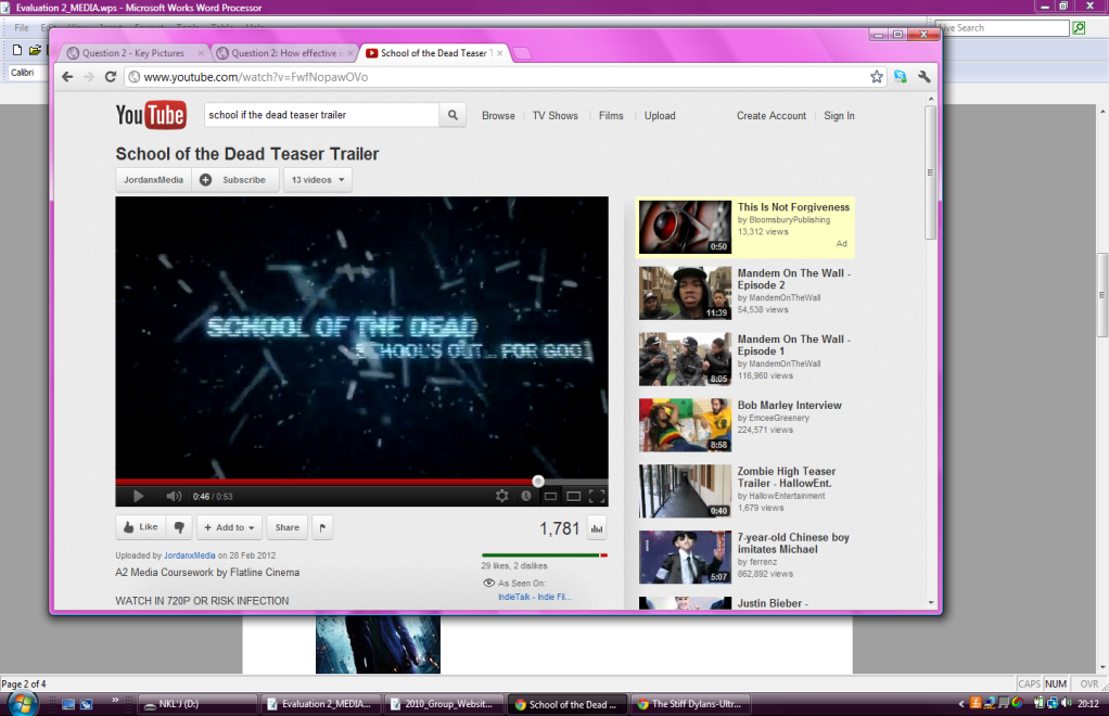
We uploaded the trailer up on YouTube were it can be shared on social sites such as Facebook. Furthermore on YouTube, you can see the amount of people that has viewed the trailer and what device it was shown on.
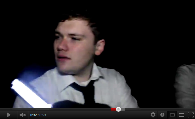
In our trailer we wanted to show a strong visual impact, so within our trailer, we used a fuzzy camera effect as we displayed our title and captions in the trailer to give off an unfocused image representing danger. Furthermore we added sound effects like gunshot to increase the tension of the trailer making the audience more engaged with it; catching their attention making them want to see the movie.
|
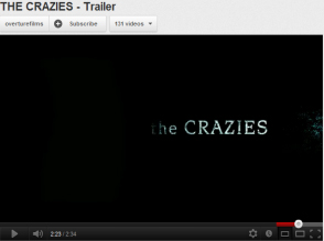
Our trailer was influenced by other horrors such as ‘The crazies’ and ‘dawn of the dead’ . Watching these trailers, we started to research more about it and eventually we came up with our horror trailer design. We thought about zombie make up and what should be featured in the trailer and what kind of atmosphere and aura should be given off. Thinking about our background music, we were inspired by ‘The crazies’ pacing in their trailer. Listening to the sound track’s intensive beat, we decided to use a similar pacing and created our own sound track using ‘Sound track Pro’.
|
|
Going into further analysis to ‘The crazies’ trailer, we found the layout of the crazies trailer a good pacing. In their trailer, they show a flowing connection in their anchorage and how they display the scene of the film. Inspired by the way that it was structured, we also did something similar but in our trailer we added a montage to the trailer after a certain timing of the anchorage.
As our target audience view and notice the pacing of the trailer, they would feel engage towards what they see. Knowing they have experience this trailer, they could share it and post the trailer up on social sites.
Poster Product
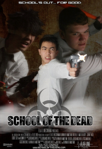
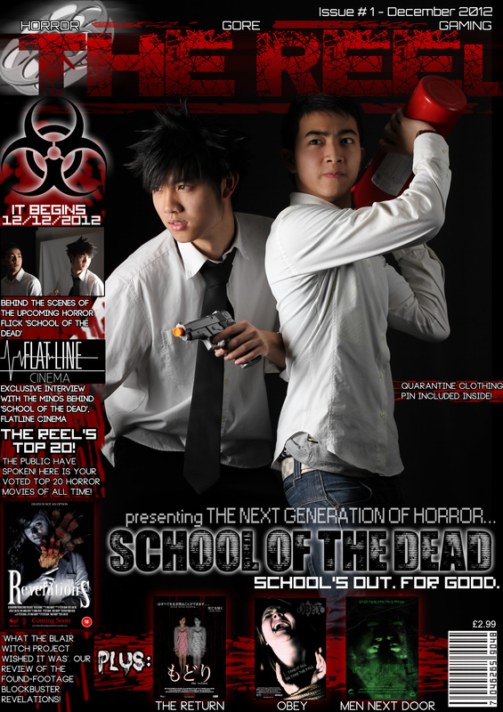
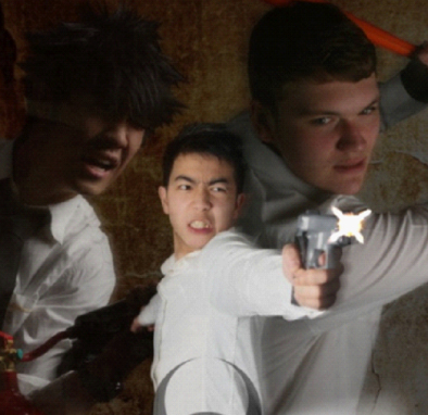
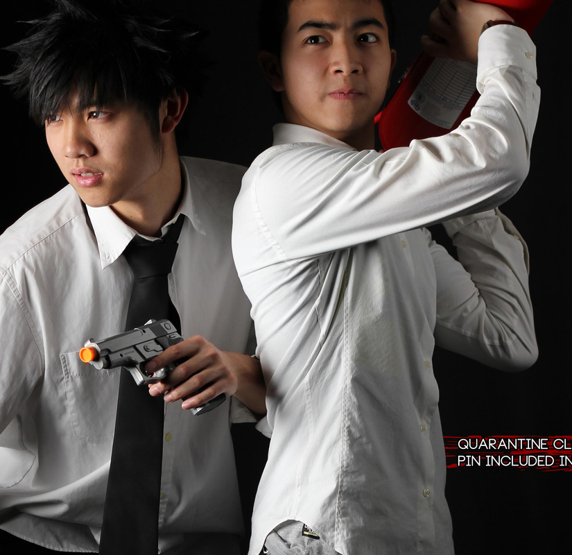
Our poster shows a visual message of horror by the way we used colours and effects such as the gradient background and the mist at the bottom of where our main title is. The Quarantine sign is placed on top of one of the characters and allowing itself and the text to standout. Not only is the Quarantine sign is made to stand out, but to also show our audience how they can spot out that this is a horror film. Editing our characters, we decreased the opacity on are characters at the back and increase the colour of their costume showing an assembly to the mist.
Our poster shows a visual message of horror by the way we used colours and effects such as the gradient background and the mist at the bottom of where our main title is. The Quarantine sign is placed on top of one of the characters and allowing itself and the text to standout. Not only is the Quarantine sign is made to stand out, but to also show our audience how they can spot out that this is a horror film. Editing our characters, we decreased the opacity on our characters at the back and increase the colour of their costume showing an assembly to the mist.

Our Film poster
|
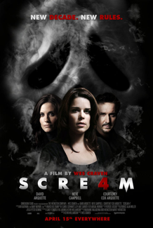
Scream 4 Film poster
|
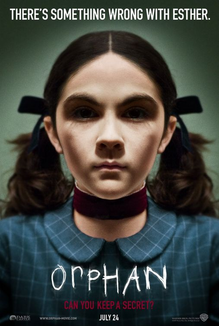
Orphan Film poster
|
Before we made our poster we researched different layouts of the posters and the ‘Scream 4’ and the ‘Orphan’s posters came to our attention. On the ‘Scream 4’ poster, the layout of the characters caught our attention and how the effects of the smoke surrounded the characters. The ‘Orphan’ poster shows a strong use of colour and effect around the character, encouraged by how they colours our displayed, we brought out the white of the character’s clothes and the colour of the objects they hold.
Using these effects, we show a strong uncomfortable aura but with the objects we display an excitement. Moreover this product links with the trailer by the Quarantine sign and the anchorage informing our audience that this is our product.
Magazine Product
A horror magazine displays many different types of layouts. Researching into the layouts and designs there are, we found that the magazines ‘Fangoria’ and ‘SCARS’ came to our interest the most.
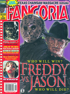
The layout of ‘Fangoria’s magazine influenced us and from it we used a similar layout and made our magazine
|
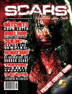
Also the magazine, ‘Scar’s’ colour scheme really caught our sight with the bright red and how it made a connection with the image displayed.
|
|
Inspired by those magazines, we used colours: red, grey and white as the colour scheme to our magazine. We can see that on the magazine they used the same or similar anchorage to the cover lines therefore this shows a connection within the magazine. As the colour scheme is red, grey and white, we wanted our viewers to recognise our product so we use the colour red to draw in our audience attention. Besides that we also included the original colours to our product (grey and white). By using these colours, it contrasts with the red and bring out the images shown on the magazine, allowing our viewers to be more engaging with the product.
|
Continuity
When promoting a media package, continuity is key. By this I mean that you have to have all of your products feature some sort of trait to establish it as a brand and recognisable product as a whole. There were a few ways in which we did this for example:
|
|

|
The logos shown between all three of our products are also extremely similar, with the only slight difference being that within our trailer we changed it slightly to suit the other captions featured within the trailer. This will make our package more noticeable to the public as the logo will become a familiar sight after a while of advertisement.
Trailer product
|
Magazine front cover product
|
Movie poster product
|
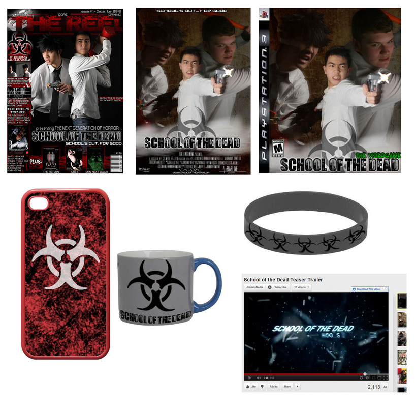
We made the 'Quarantine' symbol the mascot of our product, featuring it on our magazine front cover, our movie poster, and as an 'easter egg' in our trailer. We also then put this symbol on various possible merchandise that could be sold in shops to help push our brand and advertise it further:
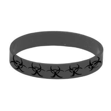
School of the Dead wrist band
|
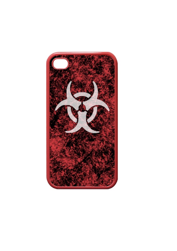
School of the dead phone case
|
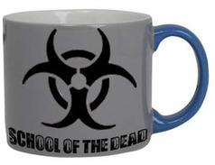
School of the dead Mug
|
|
We also had all of our main characters feature in all 3 of our products to show continuity
|
|
This is a prime example of synergy within a media package as all of the products work together through the use of continuity.
Advertising
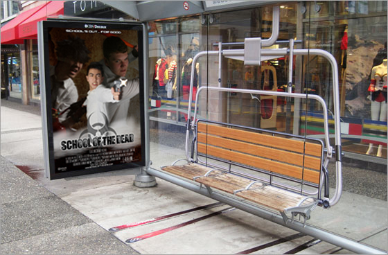
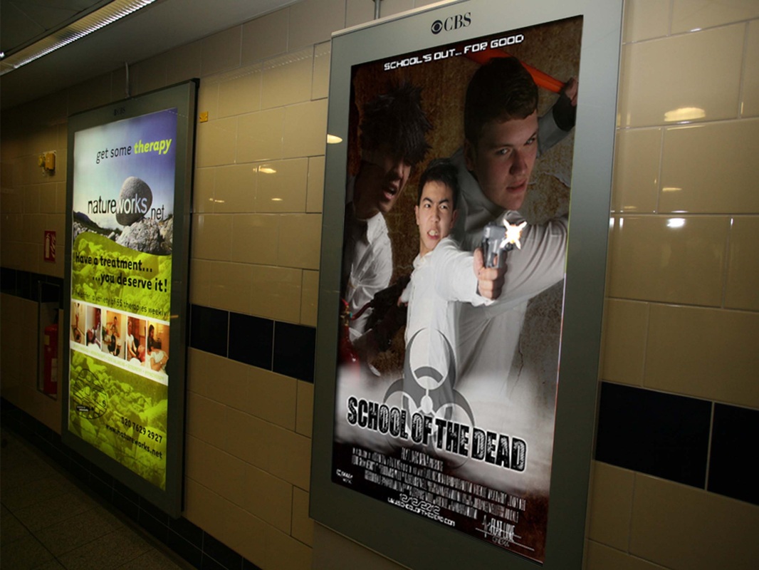
To create a buzz or 'hype' for a media product advertising is a necessity. Advertising is one of the most lucrative highest grossing industries in the world, and without it the majority of products would instantly be unsuccessful. To help market our product and increase how well our products work together as a promotional package, we decided to try several different routes of advertisement, with one of these being transport.
|

|
|
Transport whether it be buses, trains, or underground tubes attract millions of people every day, and having your product advertised either at stations, stops, or inside the vehicles themselves is a great opportunity for spreading your brand and becoming recognisable.
|
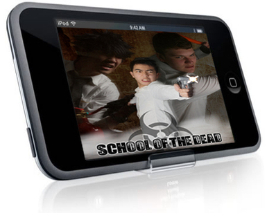
We also created an iPhone/iPod Touch package, consisting of an app full of actor interviews, behind the scenes information, and lost of bonus features, and also an app for a School of the Dead mini-video game. This would reach out to a much larger audience as our products would be in the Apple App store which has an extremely large amount of visitor traffic every day, meaning that a small percentage of those people would possibly download our app and then be interested enough to want to watch the movie.
|

All in all, this shows that Cross media convergence is key as it enables you to advertise your products to different types of people who like different types of media products.
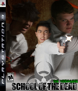
As you can see we have created our own School of the Dead video game
|
Looking back at The Dark Knight product package consisting of
|
By creating all of these additional products to be added to our School of the Dead package, we have extended our audiences experience of the film by offering a range of additional content, with everything from the movie itself, to clothing, to video games to posters to advertisements to magazine covers.
Through the use of Cross media promotion and advertising our products on websites such as Facebook, Twitter and Youtube, we have gained views from all around the world, from the United states to the Philippines to Romania.

View percentage displayed on map
The majority of our views are from the UK, however there is quite a nice even spread of views all over the world
|

Top locations by views
|

And through the use of Youtube we can monitor where our views are coming from, and we found that the majority of our views came from Facebook. This shows that combining the media platform of Youtube and Facebook has been most successful for our product.
Overall throughout advertisement on Twitter, Facebook, Youtube, and a range of other sites and forums we have created an identity for our media product package as a whole, and with the creation of several additional products such as the iPod app we have created a brand for our product. And by following conventions of synergy (such as having a consistent logo with all of our products) we have created synergy for our package, and the combination of our main product and ancillary texts is extremely effective judging by our Youtube statistics and social networking feedback.
